Carebook Website
The Problem
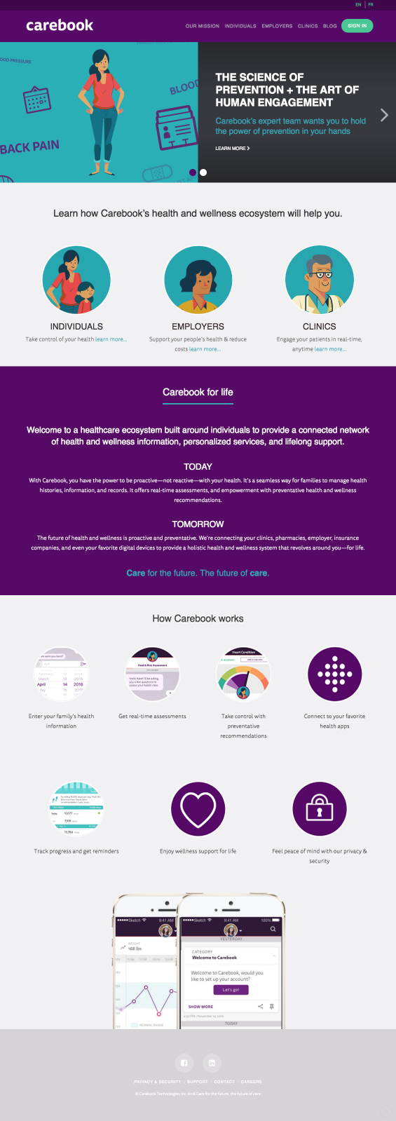
Carebook, a health company located in Montréal, was about to launch their app and wanted a refresh for their website. Working with the Brand Department, I had to come up with a design that would help guide the user through the services they offered and reflect their new airy branding, while maintaining the core foundation of the website that had been created just a few months prior.
Limitations
The foundation of the website would need to stay intact, and while I could reuse different content blocks across the site, I had to ensure that whatever I designed wasn’t straying too far from the original layouts.

Solutions
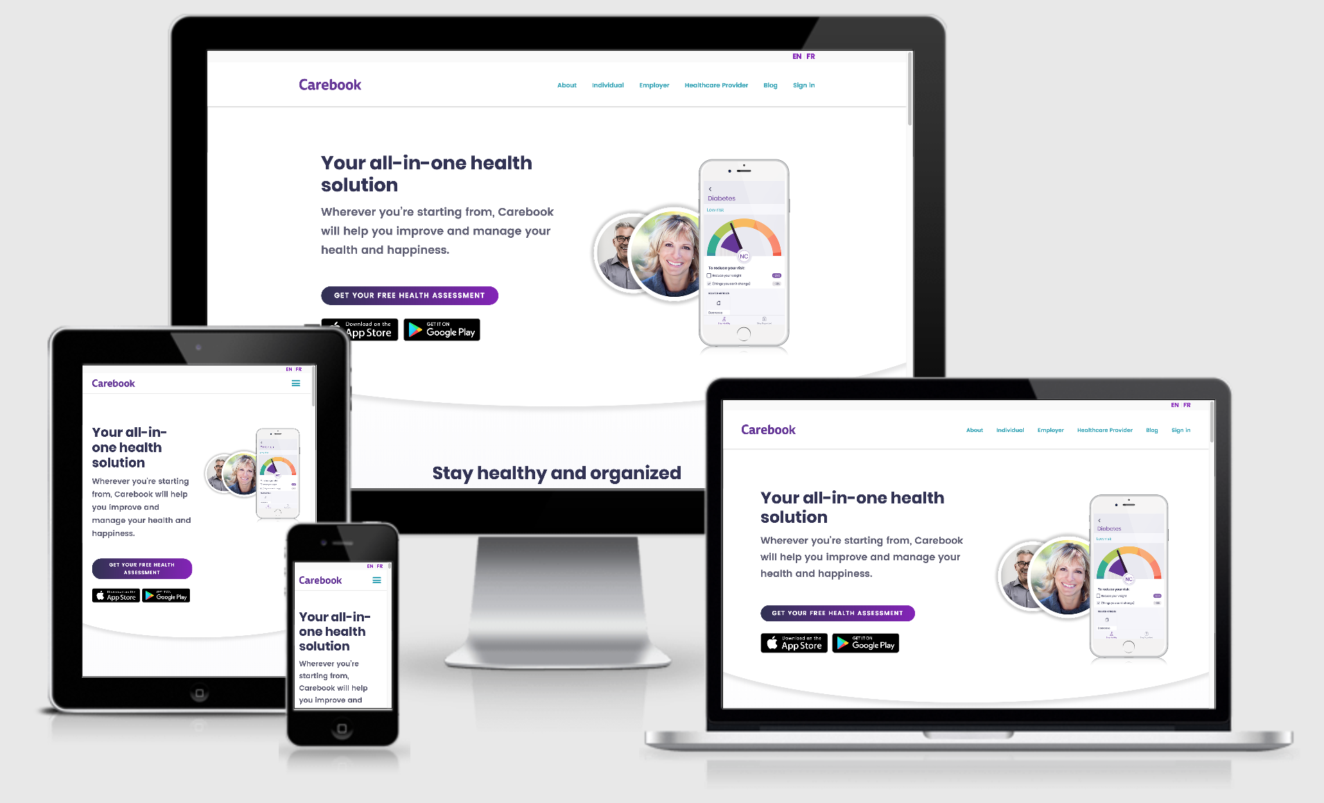
Using white as the primary color, I highlighted the light, airy, and clean feel that the company was going for with their new app launch. I pulled in the gradients used within the app to bring attention to the buttons and horizontal content blocks.
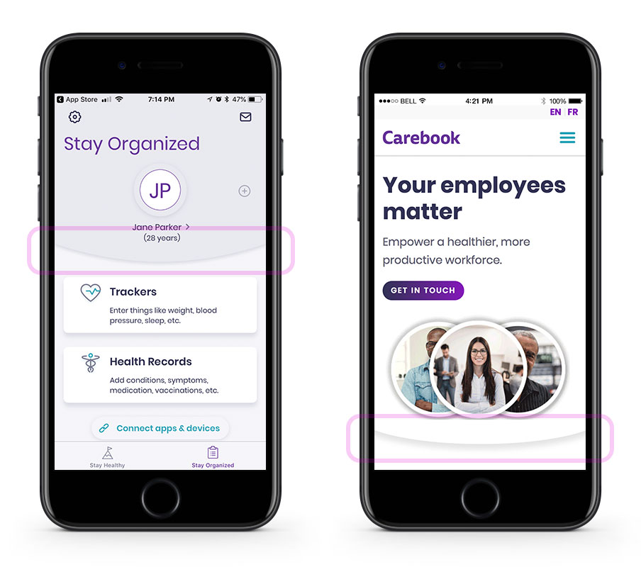
These gradients were then also used within the custom illustrations throughout the website and app which I placed in spots that broke the visual containers of content.
Homepage featuring beautiful illustrations by Neil Hooson on a responsive website in English and French
My Role
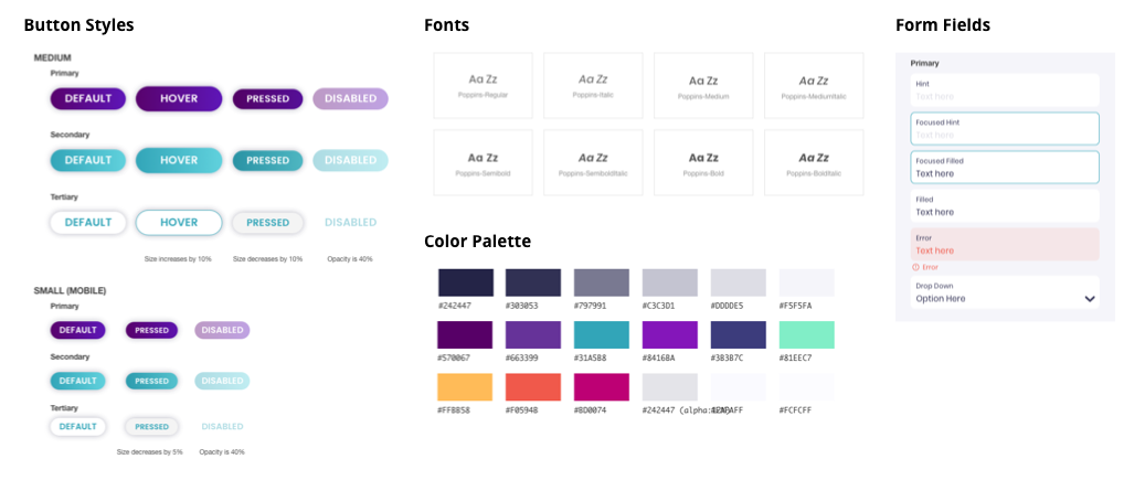
This process required working closely with the designers at Carebook who were building out the app’s design to ensure we were staying true to the brand’s style. Along with the design for the individual pages, prototyping, and asset creation, I created a style guide for the web presence and compiled the information in InVision for developer hand-off.
The Brand Department, led by Nick Clements, gave me great content to work with including Deanna Kent’s beautiful editorial copy and Neil Hooson’s illustrations, with Fransisco Carreon building everything together as web developer.
Learned Lessons
This was a great project for learning how to work alongside an established team and build a complimentary style guide and design system for web use.
-
CLIENT Carebook
-
LINK https://carebook.com/
Related Works