Disney’s Snowflake: A Custom WordPress Plugin
The Problem
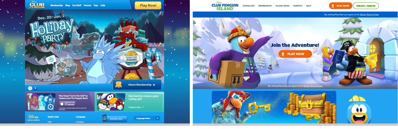
During the years of Club Penguin, we had a large website with over 2 million visitors a month and it needed daily updates to the marketing messages, blogs, content, and support pages. The process for this was very lengthy and involved multiple developers and designers to make simple changes. With our new product, we needed a change.
The solution envisioned was a robust WordPress plugin where an average content creator, which we called a “Maker”, would be able to build pages together using different types of blocks of content, which we called “widgets”. Together, these widgets made up a grid system either in static rows or a dynamic grid that populated completely customized and responsive pages. A Maker could add and edit pages in multiple languages in under 30 minutes through a clean and easy-to-use back end system based off of WordPress with little to no dev work needed.
Limitations
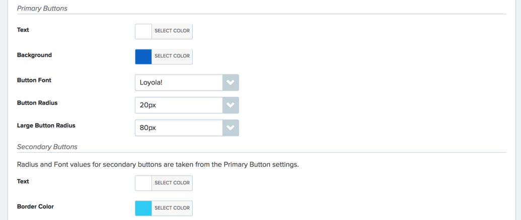
Flexibility
Every feature I designed had to be as flexible as possible – if in the future, another Disney IP wanted to use the platform, they would need to be able to brand it the way they wanted and manipulate the content the way they needed to (not every IP would have rounded corners as part of their style guide or characters/mascots for the blog, like us).
Scope & Focus
During almost the whole time I was on this project, my focus was also split to work on Club Penguin Island content, so it required strict organization and the ability to focus on the task at hand for that sprint. I started separating my notebook into color areas where I could keep track of my sprint tasks.

I had to stay extremely organized with my files so I could be productive as possible when I had time allocated to work on this project, so when Sketch Libraries came out I jumped on the opportunity to convert our asset system into a Library. I had to make sure I maintained the same asset structures throughout the files I had in case another designer needed to jump in on the project.
An example of my very organized Snowflake Sketch Library ♥
Solutions

The grid system allowed for a responsive view on all platforms while only building once. When it came to editing the homepage for events, it was easy to update the assets and then revert back to the regular version. The back end system was clear, consistent, and provided the tools needed for Makers to easily take action.
The Flows
Every feature started with a sketch in my notebook, a large cup of coffee, and a good conversation with my developer. If we didn’t walk away with both of us having questions to answer, it was a full moon.
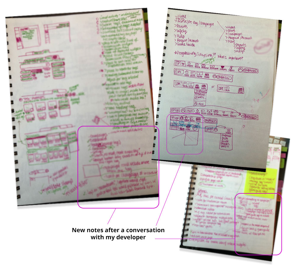
When time allowed, we worked together to figure out how best to create a generic solution and covered the different use cases and technical limitations of our specific systems (image caching, what we stored vs. what we didn’t, etc.) so that I could present something that could actually work. When time was crunchy, I would get feedback from my dev really early on in order to iterate quickly and present my findings based on additional research and experience. The feature would then move on to mockups in Sketch and simple prototypes in InVision to be play tested.
Custom Fonts
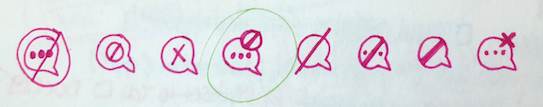
As a team, early on we decided that we were going to use an icon font as much as possible throughout the website (front and back end) to create a cohesive look and feel as well as to cut down on the amount of raster images being used. I got to use Glyphs to edit, create, and export font files for desktop and web purposes.

Launch
We launched with a robust content management system that was easy to understand, quick to update, and stayed true to the brand through customization.
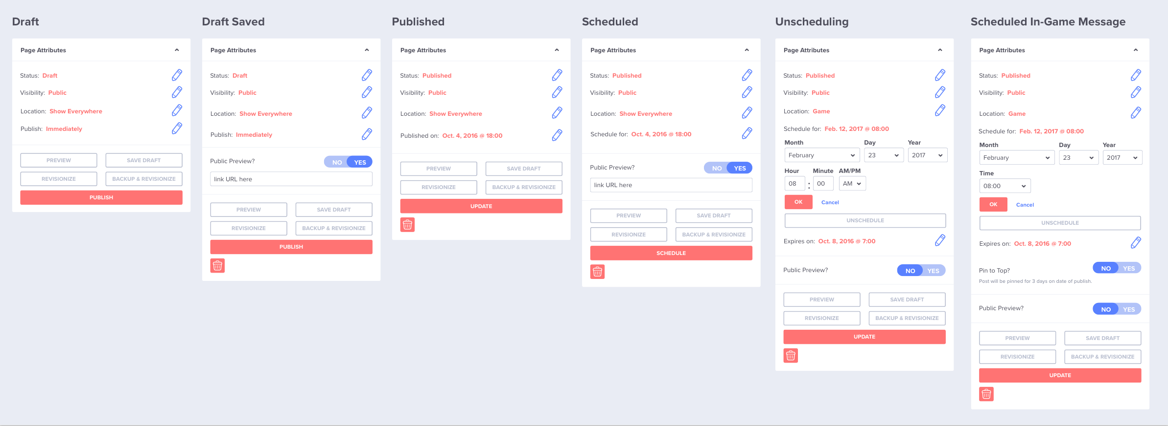
An example of our create flow
My Role
This project had been started by another senior designer, Nicki Stearns, and while she was still on our team I was able to help out with some small tasks. When she left to pursue new opportunities, I took on the position of lead web designer and worked very closely with our producer, Daniel Borthwick, and our web developer, Rod Miles, to create the rest of the features. I mocked up designs, helped distinguish specific user flows, designed for generic use, created fonts, hosted play testing sessions, actively worked with our social team to develop new features, and assisted in creating CSS animations.
I have always been familiar with HTML and CSS, but this project provided an opportunity to get familiar with accessibility standards in web and new processes to make CSS animations. When I wanted something specific, I would mock up a codepen.io in HTML and CSS for my developer to base his interaction or style off of.
See the Pen CSS Voting/Polls Loader by Stefania (@stefanialasagna) on CodePen.
An example of a CSS loading animation I did for my developer to implement
Outcome & Learned Lessons
This project was extremely successful – while it used to take a full team to do a single page or banner update before, it now took a maximum of two people to do the same update while using Snowflake (and this includes QA) with some updates taking less than 20 minutes to get to production. Iterating on this project was extremely rewarding and it taught me a lot about creating generic and usable solutions with a focus on flexibility, responsiveness, and accessibility standards.
If I were to go back and make changes, I’d collapse some of the widget options into one “master” widget with more variables to make the initial choice less confusing.
Related Works